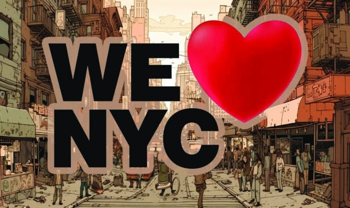
New York City has unveiled a new logo for its “We Love NYC” campaign and the reactions have been… interesting. The design features a heart in place of the word “love” and has been stylized as “We ❤ NYC.” While some have praised the campaign’s focus on community togetherness in the post-pandemic era, many have criticized the new logo’s design.
Critics have pointed out that the original “I Love New York” logo, designed by Milton Glaser in the ’70s, is a classic example of simplicity and symmetry. The new logo, however, is not as compact and is not a square, leaving some people scratching their heads.
But fear not, defenders of the new logo have emerged. They argue that the “We Love NYC” campaign is not trying to replace the iconic “I Love New York” slogan, but rather build upon it and create a new focus on civic engagement.
In fact, the campaign includes an element called “Spread Love NYC,” which is a nine-month-long initiative aimed at engaging citizens in both long and short-term volunteer opportunities. And who knows, maybe the new logo will grow on us over time. After all, the original “I Love New York” logo was not an instant hit, but it eventually became a cultural icon.
Regardless of whether you love it or hate it, one thing is for sure: New Yorkers are not known for holding back their opinions. So, brace yourselves for more witty comments, hilarious memes, and scathing critiques of the “We Love NYC” campaign in the coming weeks.


