Even though people have for a while said that search marketing is on the road to its end, it is not going anywhere. Marketers are still as interested, if not more interested, in search as they were in past years. Another thing that everyone knows is that Google has dominated the search advertising world for quite some time now, and they show no signs of letting up. Google is constantly improving on their search marketing offerings, keeping marketers happy with the results they see. Now, marketers spend a lot of money on search, trying to get their results as close to the top of the results page as they possibly can. Something that affects search results more than some marketers think is the actual design of the results page itself. It will not matter where your results appear if a results page is poorly designed, because that is part of what makes people click.
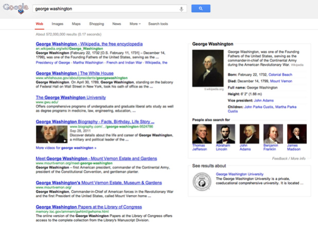
I bring this up because Google has just announced a redesigning to their search pages.
You’ll notice a new simpler, cleaner design on the search results page — we’ve been working on ways to create a consistent search experience across the wide variety of devices and screen sizes people use today. We started with tablets last year, got it to mobile phones a few weeks ago, and are now rolling out to the desktop.
With the new design, there’s a bit more breathing room, and more focus on the answers you’re looking for, whether from web results or from a feature like the Knowledge Graph…
Sure, considering the design of the page where your search results are going to appear is not the biggest consideration that needs to be taken, but it is one. This new Google design, which we have already seen on their mobile platform for the past few weeks, will help internet users search more effectively. Not only that, but users will potentially have an easier time finding marketers’ paid results, which could make this redesign of even more importance. Nothing too extreme will change, and Google’s functionality will not be altered at all, which could be the worry for some people.
The same advanced tools you’re used to are still there when you need them. Just click on “Search tools” to filter or drill down on your results…
Google has seen some good attitudes toward the new design from users of the company’s search on mobile platforms, so I can only assume people will feel the same way about the desktop version. The company has provided images in their blog post, and the design looks quite clean and more functional, just as they’ve stated. For marketers who rely on Google to supply them with an effective environment for search advertising, this new design will inevitably help with advertising somehow. It may seem like a simple redesign could have very little effect for marketers, but Google stated that they are working on better ways to find, “answers you’re looking for.” This could mean that users will also be able to more easily find the advertisements that pertain to their search.


