Facebook Ads is an amazing tool, even just to play around with. I often find myself creating fan pages and setting up new ad campaigns, just to see the different images that can quickly swing a campaign from boring to interesting.
When using the same text ad copy and only changing the image, you can learn a lot from your advertising.
After Blake Griffin posterized Kendrick Perkins with that ridiculous dunk a few weeks ago, I thought it would be interesting to create a fan page around it and test a few different Blake Griffin images and see how they perform. The fan page would just be a place of conversation for fans, and no monetization was put in place. In this test I grabbed a few different images, ranging from just Blake Griffin, to different pictures of him dunking, and some of them were pictures from the actual dunk on Perkins.
Each of the campaigns received around 30,000 impressions and were targeted to users 18 or older, in the US and interested in “Blake Griffin”.
Top Performing Image
Of the images I setup, this one was the clear winner. I wasn’t that surprised, as it featured the actual dunk against Kendrick Perkins, while also throwing a big image of Blake Griffin looking down on Perkins. Overall it’s just a high quality image with Facebook Ads.

Average Performing Image
There was a wide range of “average” click through rate image. This one had a .154% ctr, and again was featuring a capture of the famous dunk on Perkins. It’s all about the action shot and how the user perceives the image, and grabs their attention.

Worst Performing Image
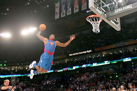
When looking through the images used in this test ad campaign, I had much higher expectations for this image. It was made famous as one of the dunks from Griffin during the all star break. It was actually one of the lowest performing images in the collection. My first impression when I saw the image, was that it would perform much better because it was kind of weird looking, and was actually perfectly scaled for 110×80 sizing of Facebook Ads images.

The Take Away…
So what can you learn from this quick Facebook Ads test? For the most part, the importance of adding a wide selection of images when creating an ad campaign. If you only pick the images that you think will do well, you are already setting yourself up for failure.
As mentioned, this was just a fun case study I put together, but there is actually so much more than could be setup for this niche and ad setup. There are plenty of affiliate offers out there for NBA jerseys and you could even create your own poll around the campaign. Another way to improve click through rates is to play with the ad copy titles and mess around with the images (borders, distort, highlight).
Sponsored by:
Find Great Facebook Offers at AxonMedia Group


